
Unica, Space, Force. Three five-letter words, each of which is fundamental to defining the identity of the collective that envisions, studies, builds, and promotes the generative habitats presented in this volume.
Unica declares its origin: the group was founded within the University of Cagliari with a primary aim of teaching, research, and disciplinary reflection. However, its field of activity—and communication—is much broader, extending to the communities, public authorities, associations, technicians and craftspeople with whom it engages from time to time.
Space identifies its object: Unica Space Force cares for common spaces, particularly those that have been abandoned, forgotten or underused, exploring their possibilities and revealing their unexpressed value. Space, however, is never seen as an end in itself, but rather as a tool through which to (re)activate processes of interaction within the communities involved, whether they consist of the inhabitants of a neighbourhood or rural area, students of a faculty, or visitors to an exhibition.
Force expresses its nature: rejecting any coercive connotation, the term characterises USF both as a specialised working group and as a dynamic agent capable of altering the state of a system.
The branding project sought to achieve a balance between these three components, heterogeneous yet equally important. At the same time, the disciplinary aspects that make the collective's interventions recognisable were further explored, including self-build practices, architectural language, structural modularity, simplicity of construction, and the radical nature of the built work, as well as clarity in architectural representation.
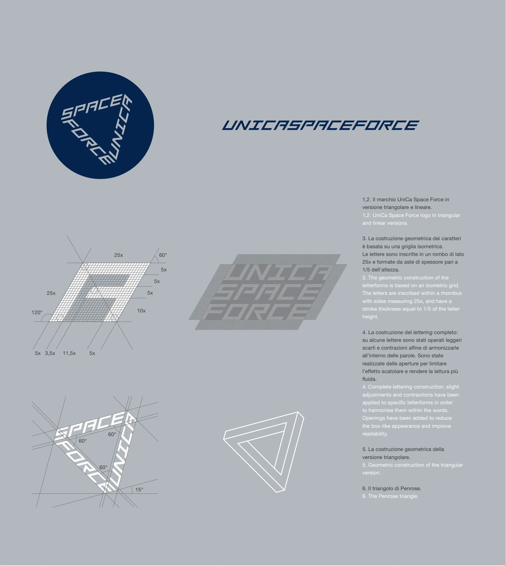
The objective was to bring out, within the necessarily partial and condensed form of a brand, the distinctive character of an approach to architecture, channelling the themes outlined above into a proposal addressed to the academic sphere, but equally effective and flexible in all the contexts the group will encounter along its path.
The design of a custom lettering was immediately identified as the most appropriate strategy for graphically expressing this way of practising, learning, and teaching architecture. Faced with an identity already strongly defined by its name, the introduction of a symbol would have been superfluous, redundant, and inconsistent with the vocation for simplicity declared in the Manifesto. Therefore, USF’s visual identity was left entirely to the way the letters are drawn and assembled, translating the characteristics of generative architectures into a system of signs.
The result of this process is a modular, monospaced logotype based on a polygonal matrix. The characters are derived from a limited set of stems and geometrically constructed as isometric axonometries, featuring characteristic angles of 120° and 60°. In addition to evoking a representation method in which all three spatial dimensions have equal relevance, this solution gives the lettering a strong sense of dynamism and introduces the possibility of arranging words along different directions, simulating a three-dimensional development.
In its ‘official’ version, the logotype consists of the words UNICA, SPACE, FORCE rotated in relation to one another to circumscribe an equilateral triangle, arranged so that they can be easily read without rotating the medium on which they appear. The resulting geometry recalls the Penrose triangle: an impossible object composed of three prisms orthogonally connected to each other which, by closing into a triangle, establish a visual paradox.
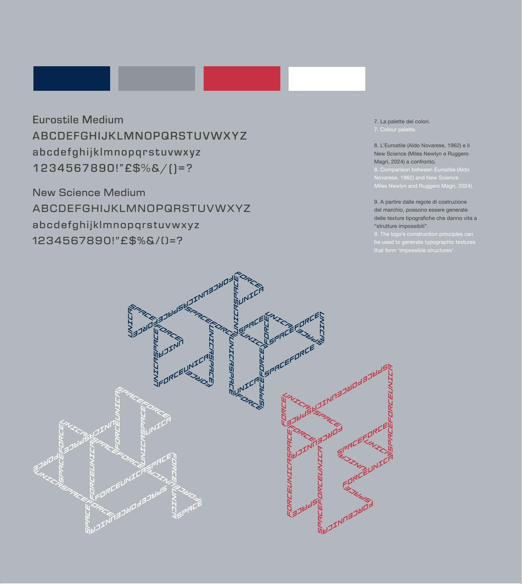
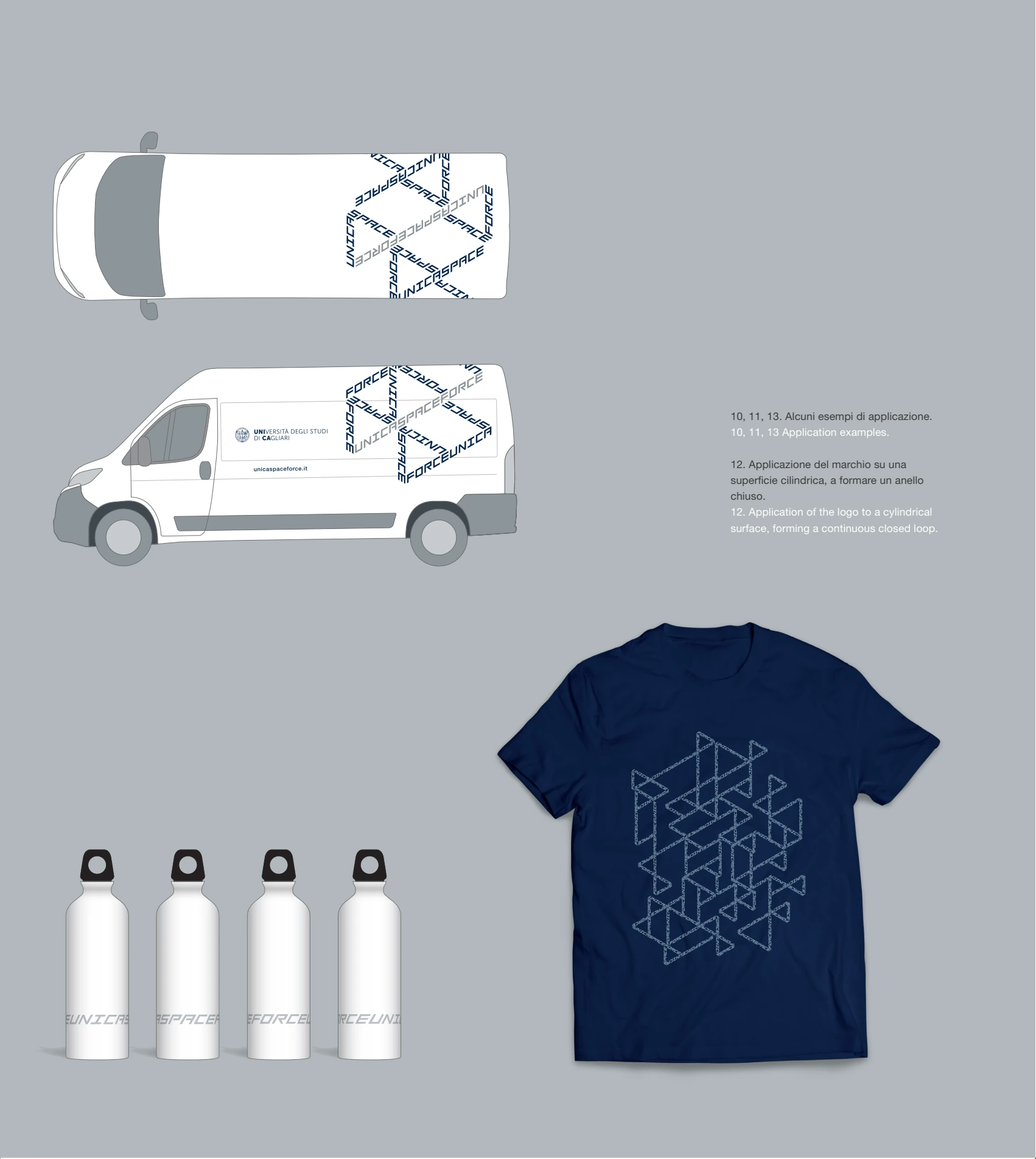
The particular construction of the characters, however, gives them a recognisability that goes beyond the geometry in which the logotype can be inscribed. This frees the brand from the need for a rigid conformation and opens it up to changing configurations adaptable to different contexts: it may unfold in a linear sequence, become an "orbiting" object to be used in animations, close into a ring when applied to cylindrical surfaces, or contract into the acronym USF, eventually transforming into a typographic texture capable of articulating into free and complex shapes, without ever losing its distinctive traits. This internal coherence and flexibility mirror those of the generative habitat.
The associated visual identity plays with the paradox suggested by the name: Unica Space Force, where the ‘space’ in question is not interstellar but rather the space shared daily by communities, and where the futuristic technologies of science fiction are countered by a limited budget and the “praise of inaccuracy”. It is interesting to observe, however, that generative architectures function as actual rovers in what are, ultimately, “space explorations”.
The graphic design project embraces this dual reading and does so by operating exclusively through two components of the visual identity: colour and accompanying typography. From a chromatic point of view, to evoke the imagery of the Space Age, it was enough to slightly shift the institutional colours of the University of Cagliari: blue, red, silver-grey. As its primary typeface, New Science was chosen: a contemporary reinterpretation of Eurostile, which was designed in 1962 by Aldo Novarese and became a classic of typography, widely employed in sci-fi cinema and television.
These two elements provide the framework within which visual components of various kinds can be freely integrated: decorative textures that translate the structural grid of timber studs into page-layout systems (as on the cover of this volume), infographic elaborations, or even derived identities specifically conceived for individual design workshops which, similarly to science fiction sagas, can be imagined as “episodes” within a broader narrative.